Every individual is all about functionality ahead of aesthetic designs any time, any day. While a beautifully designed website might be able to catch the attention of your customer, it can only go that far if they do not function properly. However, we believe in good designs; in fact, your website’s design may make or ruin it. Not to mention that your website is at the heart of your digital marketing plan; you will not see digital conversions if you do not have an excellently designed website. That is the very starting point for any website owner that is interested in conversion.
Here are a few crucial website design features to improve if you want to increase conversions:
1) Simple Navigation

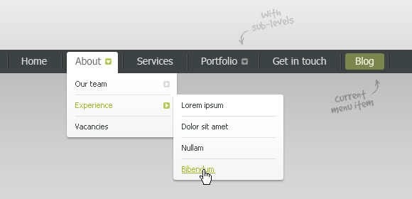
Your website designer has complete control over where your visitors go. Driving conversions rely heavily on navigation. The items in your menu bar may make or break a visitor’s experience on your website. They’re also a terrific method to make it very obvious what you do. Navigation is a critical website design aspect that may be optimized particularly for higher conversions.
If you’re creating a website and want to increase conversions, keep your top navigation menu as simple as possible. If you have 6 separate dropdowns with 5 different options each in the top header, your visitors will struggle to figure out where they want to go.
Try to limit your navigation to a few dropdowns and sections, and make sure that at least one of those options leads to a call-to-action or a contact page link. Talking about the call-to-action option, you can be creative with it so things will not be boring to your customers.
A typical example of a call-to-action option is the one we have on this website. It pops up on every page by the far bottom corner of the right side of your screen. It is a very good example because it represents the rule of keeping it simple, yet exciting. Clicking the green-colored “chat” symbol will open the question box, where you can directly send a message to a representative. The best part of this feature is that it does not disrupt or affect whatever page you are on, since it is a pop-up. It relieves you of the stress of having to look for a separate page dedicated to the function it is doing effortlessly. You also get to relay your messages to a customer representative without having to open your email app or website.
This is only an example; as a web designer, you can come up with your beautiful ideas to spice things up with your customers. Just make sure to remember to keep it simple and very effective.
2) Layout of Content

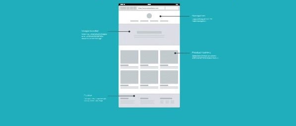
Let’s be honest; if this webpage is not properly designed in terms of its layout, you would have closed the page immediately you stumbled upon it without reading the content. You wouldn’t care whether the content is useful or not. Content with no bold or distinctive headlines, paragraphs, bullet points and font will probably appear like super-boring “terms and conditions”. With some fonts, it may even appear like some sort of code that you will most likely not have the patience to decode. But because this page is well laid out, even if you won’t read the whole article, you will run through the bold headings, subheadings, and bullet points.
Writing on the web is a completely other ballgame compared with hard copy books. Audiences no longer read right through anything. According to research after study, headlines, strong headers, and perhaps a few paragraphs pique the interest of the ordinary internet user. Aside from that, a website owner will have to come up with something incredibly interesting to retain their customer’s attention. This is greatly aided by design. This is why the importance of content arrangement in website design cannot be overstressed.
You’ll note that well-designed websites try their best to provide compelling material but recognize that most users aren’t going to hang on every word. The way you arrange your posts and articles has a significant influence on how much of it your customers will read.
The more appealing your layout, the more people will read it. And the longer visitors read your content and stay on your pages, the more probable it is that they will convert.
3) Consistent, Recognizable Branding
People feel more at ease converting when they know who you are. If consumers get to your site and think, “Oh yes, I know these folks from the so-so platform”, they won’t be concerned about providing their email addresses or becoming loyal customers; they’ll simply do it for the fact that they know you. In web designing, this concept is known as a branding element.
If your site appears completely different from your content on social media or your brand elsewhere, you will have difficulty converting visitors. People won’t feel comfortable converting if they don’t recognize your brand. Once again, good web design may assist; therefore, you should endeavor to build a unified design that matches your brand and extends those design elements across all of your digital channels.
From your LinkedIn display picture to your Facebook cover photo, it’s critical that anytime a potential lead comes across your firm, they quickly recognize you as the same company they saw on your website or elsewhere.
4) Color Palette That is Intuitive and Intentional
Your color pallet is one of those web design aspects that doesn’t have to blow anybody away, yet it is quickly seen if done incorrectly. When done correctly, a well-designed website with a purposeful color palette performs an excellent job of promoting conversions. It’s a web design feature that often goes unnoticed, but it’s actually pretty useful in converting your visitors. You’re guiding the visitor’s attention exactly where you want it to go by using pops of color on calls-to-action, pop-ups and other key content.
Not to brag, but our website is a great example of a planned color choice. When a visitor lands on our website, the first color they will see is white; then, the other primary colors which are green and blue. All the sections’ icons appear in blues on white backgrounds, while the green color comes into play with majorly symbolic icons on white backgrounds. In some parts of the pages, green or blue is the background color, while white is the text color. Then, the green-colored call-to-action icon by the bottom of the right corner of the screen. All these serve the purpose of flawlessly directing the attention of our visitors to where we want—where to convert actually.
Your color palette can function in a similar manner. Choose selections that represent your business and identity, but don’t feel obligated to go overboard. Your color palette should emphasize important information and make it simple for users to go to the areas of your site where they can convert.
1. Empty Space
Come next year, white space will be a big web design trend. It not only improves the appearance of your website but is also an excellent tool for increasing conversion. White space is quite effective in drawing your visitor’s attention to where you need it.
It’s also a terrific method to extend their stay on your website. If you’ve ever visited the websites of content marketing specialists, you’ll notice that they employ a lot of white space on their website, especially on information-heavy pages like blogs. This isn’t simply for creating a visually appealing blog, but it is also an important strategy to elongate the time a visitor spends on a page. The more whitespace there is on content pages, the more people will read them.
The average customer can only read two or three lines of text at a time. Anything more would be overpowering. Whitespace helps to break up large amounts of material, bringing visitors deeper and deeper into your page. The process is synonymous with how paragraphs work.
SEOs and digital marketers understand that the longer someone spends on their website, the more probable it is that they will convert.
5) Responsive Design
If your website isn’t responsive, you’re overlooking a critical website design aspect that will lead to conversions. One of the most basic requirements for every website is simply a responsive design.
Mobile devices account for more than half of all internet traffic; therefore, if your website isn’t designed for such visitors, you’re passing up a large number of qualified prospects that may convert.
Those leads will visit your site, note how bad it appears on their phone or tablet, and go on to another site that provides the same content in a more appealing style. Then your competitor receives that convert, and you lose out.
For the sake of emphasis, if your website isn’t responsive, you’re losing. And by “responsive site,” it is not just about having a website that is optimized for both mobile phones and desktops. It is worth mentioning that screens come in a variety of orientations (landscape or portrait), forms, and sizes. It is essential to make sure your site is built to look great on every screen, no matter what size or orientation it is. That is a genuinely responsive design, and it will definitely increase conversions.
Conclusion
A functional, simple design combined with a sensible digital marketing plan and a search engine optimized website is an irresistible combo that always leads to growth. Let us know if you’re not sure why your website isn’t converting or if you’d want to increase your conversion rate. We’re here to assist you.

 Contact Develop Clicks today and discover how we can bring more patients through your doors.